An enterprise SEO dashboard usually dies of generosity. Someone connects every data source they have access to, drops in forty tiles, shares the link with the VP of Marketing, and three weeks later nobody opens it. We have rebuilt this thing enough times to know the pattern never changes: the dashboard that gets read is short, segmented, and answers a question the reader already had in their head before they clicked.
This post is the enterprise SEO dashboard we actually ship. Five rows, one screen, and a short list of the tiles we take out every single time.
Why most enterprise SEO dashboard builds get abandoned
Here is the shape of the problem, drawn as a composite rather than one named client. Picture a B2B security platform with roughly 14,000 indexable URLs across six subfolders and four languages. The dashboard has 31 tiles. Check the view log for the last 90 days and you find 19 views, most of them from the analyst who built it. If that sounds exaggerated, go and check your own view count before you decide it is.
Ask the executive it was built for why they stopped opening it and the answer is usually some version of “I could not tell from it whether we were winning.” That is the whole brief for an enterprise SEO dashboard. Not completeness. A verdict.
The five rows that earn their space
Every enterprise SEO dashboard we keep alive has these five rows, in this order. The order matters, because a reader who gets their verdict in row one will read rows two and three out of curiosity rather than duty. A smaller team can run the same idea on a single page, which is the format in our five-row SEO analytics report.
| Row | What it shows | Source | Question it answers |
|---|---|---|---|
| 1. Non-brand clicks, 28 days vs prior 28 | One number, one delta, one sparkline | Search Console API | Are we winning? |
| 2. Clicks by site section | Docs, blog, product, comparison, glossary | Search Console, regex on page | Which part is moving? |
| 3. Pages that gained or lost 100+ clicks | Top 10 winners, top 10 losers | Search Console page dimension | What changed and where? |
| 4. Indexed vs submitted | Count plus the gap, by section | Index coverage export | Is anything falling out? |
| 5. Organic signups or trials | Conversions from organic, by landing section | GA4 or the product database | Did it turn into money? |
That is it. Everything else goes on a second page called “detail” that nobody is required to open. If you want the full reasoning behind row five and why we prefer the product database over GA4 for it, we wrote that up separately in our guide to measuring SaaS SEO in GA4 and Search Console.
Row one is the only row with a verdict
Give row one of the enterprise SEO dashboard a colour. Green if non-brand clicks are up on the prior period, amber if flat within 5 percent, red if down. Executives read colour before they read numbers, and the alternative is that they read nothing. Keep brand out of it: brand clicks follow your paid campaigns and your funding announcements, and mixing them in means every good quarter looks like an SEO win.
Segmentation is what makes an enterprise SEO dashboard different
A 200-page site can get away with site-wide totals. A 14,000-page site cannot. On a large site the blog can lose 12 percent while docs gain 30 percent, the total looks flat, and you spend a quarter thinking nothing happened.
Build your sections as regex filters on the page dimension and store them once, in one place, so every tile inherits the same definition. In our experience the argument about what counts as “product pages” takes longer than the build, so settle it in writing before anyone opens a chart.
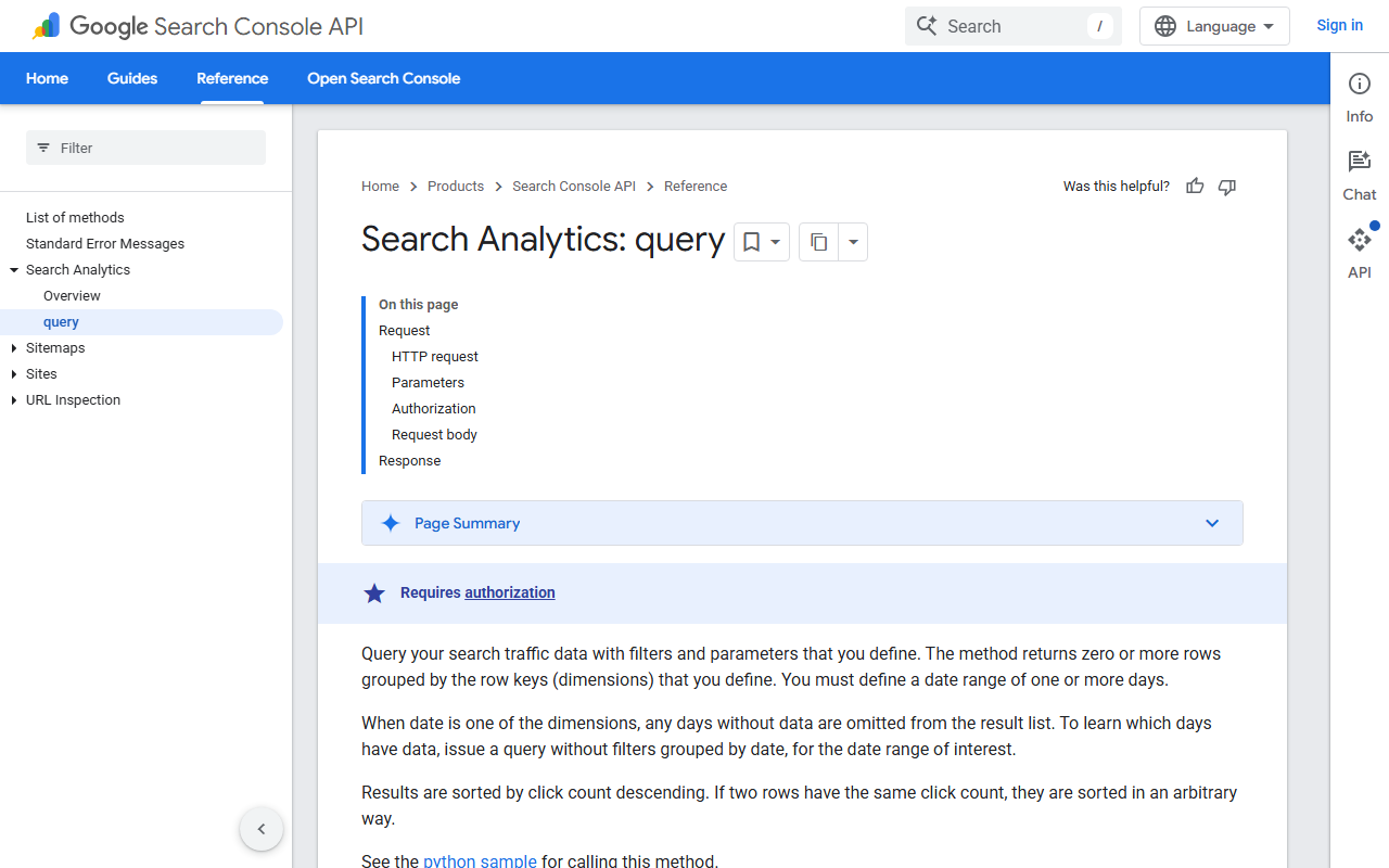
The API detail matters more than it sounds. A single query returns a capped set of rows. If your dashboard reads the totals Search Console returns, you are fine. If it sums the row list instead, you are undercounting, and on a big site you can be undercounting by a third. It is common enough that it is the first thing we check when a dashboard total disagrees with Search Console.
Tiles we remove from every enterprise SEO dashboard
- Average position. It moves when a page starts ranking at 70 for a new term, which looks like a loss. Nobody can action it. Track position for a named keyword set on a separate page if you must.
- Domain authority or domain rating. A vendor metric on an executive screen. It invites a conversation about buying links.
- Total backlinks. It goes up when a scraper copies your page. See our note on what counts in why backlinks still matter.
- Keyword count ranking in the top 10. Fine as a trend, useless as a tile, because the mix changes underneath it.
- Bounce rate. For docs traffic it means almost nothing, and docs traffic is often half of an enterprise site.
- Anything on a 12-month rolling average. It smooths out the exact week you need to investigate.
Cutting these is unpopular for about a week. Then the enterprise SEO dashboard fits on one screen and people start opening it.
How we build an enterprise SEO dashboard, in order
- Write the five questions first. On paper, before you open any tool. If a stakeholder cannot name the question a tile answers, the tile does not get built.
- Settle the section regex. One document, agreed by SEO and product marketing. Include the trailing-slash and locale cases.
- Pull Search Console through the API, not the UI export. The UI caps the export and gives you no history past 16 months.
- Store daily snapshots. A table with date, page, query, clicks, impressions, position. Even a modest warehouse table beats re-querying, and it survives the 16-month window.
- Join conversions on landing page, not on session source. Session source attribution hands credit to whatever touched the user last.
- Ship with five rows. Add a sixth only when someone asks twice.
Step four is the one teams skip, and it is the one that pays. The day a core update lands, the team with 18 months of daily snapshots can tell you which section and which query cluster moved within an hour. Everyone else opens Search Console and squints at a line chart.
What the enterprise SEO dashboard actually runs on
You do not need an enterprise platform to build this. At the time of writing, a Looker Studio report reading from BigQuery, fed by a scheduled Search Console API pull, costs a few dollars a month in query spend and covers all five rows. The platforms are worth their price when you need crawl data at scale, log file analysis, or per-market rank tracking, not for the reporting layer itself.
If you are weighing a platform anyway, our breakdown of enterprise SaaS SEO covers where the money goes. For the metric definitions behind the five rows, the SEO KPIs post has the formulas we use.
A note on refresh rates
Daily is right for an enterprise SEO dashboard. Hourly is theatre, because Search Console data lags two to three days anyway. Weekly hides the drop that started on a Tuesday. Set the enterprise SEO dashboard to refresh at 6am local time and put the last-refreshed timestamp on the page in small text, so nobody argues about stale data in a meeting.
Myth and fact about enterprise SEO dashboard design
Myth: more data sources make the dashboard more credible.
Fact: every extra source is another thing that breaks silently. A dashboard can show a 40 percent drop for two weeks because a GA4 connector quietly expired, and the team spends that fortnight arguing about an algorithm update that never happened.
Myth: executives want a drill-down.
Fact: executives want a sentence. Put the drill-down on page two for the analyst, and put a text box on page one where the SEO lead types two lines of commentary each Monday. That text box gets read more than any chart on the page.
Myth: the dashboard replaces the monthly report.
Fact: it replaces the arguing about numbers in the monthly report, which is different and better. The report still needs a human explaining why. Our SaaS SEO reporting dashboard walk-through has the smaller-site version of the same idea.
Quick recap: enterprise SEO dashboard
- Five rows on one screen beats thirty tiles across three pages, every time.
- Row one is non-brand clicks with a colour, because a verdict is what the reader came for.
- Segment by site section with an agreed regex, or a 14,000-page site will look flat while halves of it move in opposite directions.
- Pull Search Console through the API and store daily snapshots, so you keep history past the 16-month window.
- Remove average position, domain rating, total backlinks and bounce rate from the executive view.
- A Looker Studio and BigQuery build covers all five rows for a few dollars a month, so the platform decision is about crawl and rank data, not reporting.
FAQ
What should an enterprise SEO dashboard include at minimum?
Non-brand clicks with a period-over-period delta, clicks split by site section, the biggest page-level gains and losses, indexed versus submitted pages, and organic conversions. Five rows. If a stakeholder asks for a sixth, wait until they ask a second time before you build it.
How often should the data refresh?
Once a day, early morning. Search Console data is already two to three days behind, so hourly refreshes add cost and no information. Show the last-refreshed timestamp on the page so nobody debates freshness in a meeting.
Should brand and non-brand traffic sit on the same chart?
No. Brand search follows your paid spend, PR and product launches. If it shares a line with non-brand, a good quarter for the brand team reads as an SEO win and a bad one reads as a penalty. Keep two lines or two tiles.
Do I need an enterprise SEO platform to build this?
Not for the reporting layer. A scheduled Search Console API pull into a warehouse table, read by Looker Studio, does all five rows. Platforms earn their price on crawling large sites, log files and multi-market rank tracking. Compare those on crawl limits rather than on dashboard screenshots.
Why does my enterprise SEO dashboard total differ from the Search Console UI?
Almost always because you are summing the row list instead of reading the totals the API returns. The row list is capped, so on a large site the sum can be a third short. Check whether your connector sums rows before you blame the data.
How do I show SEO impact on revenue without a full attribution model?
Join organic landing page to signup in the product database, then report assisted pipeline as a separate, clearly labelled number. It is honest, it survives scrutiny, and it avoids the fight about multi-touch models. Our post on getting real keyword data out of Search Console covers the query side of the same join.
One last thing. Before you build anything, check who opened the current dashboard in the last 90 days. If the answer is nobody, do not migrate it. Delete it and start again from the five questions. For the plumbing, see the Search Analytics query reference and the Looker Studio data source docs.