A google data studio seo report is still the cheapest way to give a founder or client one link they can open every Monday without logging into three tools. Google renamed Data Studio to Looker Studio in late 2022, but most people still search for the old name, and the product works the same way: free, browser based, and wired straight into Search Console and GA4. The problem is that most templates people copy are either a wall of 30 charts or a single traffic line that tells nobody what to do next.
This guide is the build we hand to new clients. Five pages, the exact charts on each, the calculated fields we paste in, and the mistakes that make a report quietly wrong. If you are still deciding what belongs in a report at all, read our post on what an SEO report should contain first, then come back and build it.
Why we still build the google data studio seo report in Looker Studio
There are prettier dashboards. Most of them cost money and pull the same Search Console numbers through an API you could connect yourself. Looker Studio wins on three practical points:
- It is free. At the time of writing the standard version costs nothing. Looker Studio Pro adds team workspaces and support for about $9 per user per project per month, which most SaaS teams under 50 people never need.
- The two connectors you need are native. Search Console and GA4 connect in two clicks with no third-party seat.
- Sharing works like Google Docs. Viewers need a Google account and nothing else, so the CEO actually opens it.
Where it falls short: it gets slow past about 15 charts per page, blending is clumsy, and GA4 API quotas can blank out charts when several people open a heavy report at once. The google data studio seo report below is designed around those limits.
Before you build: the two Search Console tables
When you add the Search Console data source, Looker Studio asks you to choose a table. This choice causes more broken reports than anything else we see.
| Table | What it aggregates by | Use it for | Do not use it for |
|---|---|---|---|
| Site Impression | Property (one count per search, whatever the number of your URLs shown) | Headline clicks, impressions, CTR, average position | Anything broken down by landing page |
| URL Impression | Page (each of your URLs counted separately) | Landing page tables, page group comparisons, query-by-page views | Site-level totals, because impressions run higher and CTR runs lower |
Add both as separate data sources. Name them clearly (“GSC site” and “GSC URL”) so nobody drags a page chart onto the wrong one. If your totals in Looker Studio do not match the Search Console interface, the table choice is the first thing to check, and it explains the gap in most cases we debug.
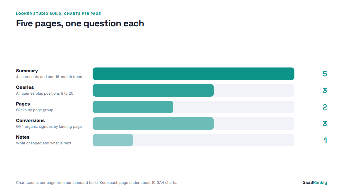
The five-page google data studio seo report, step by step
We keep every page to one question. If a chart does not help answer that page’s question, it goes to an appendix page or gets deleted.
Step 1: Summary page (Is organic growing?)
Four scorecards across the top: clicks, impressions, organic signups, and organic share of all signups. Each scorecard gets a comparison to the previous period and the same period last year. Below them, one time series of weekly clicks for 16 months, which is the most Search Console keeps. That is the whole page. A founder should be able to read it in 20 seconds.
Step 2: Queries page (What are people searching?)
One table from the Site Impression source with query, clicks, impressions, CTR and position. Add a filter control for a branded regex so the viewer can flip between branded and non-branded. Then a second table showing only queries at positions 8 to 20 with more than 200 impressions. That second table is the to-do list, and it is usually the most used chart in the report. Our guide to Google Search Console keywords covers the regex patterns we use to slice it.
Step 3: Pages page (Which URLs earn the traffic?)
Switch to the URL Impression source. A table of landing pages with clicks, impressions and CTR, plus a calculated “page group” column (blog, features, comparisons, docs). A bar chart of clicks by page group sits on top. This is where teams spot that the docs folder quietly drives a third of organic clicks.
Step 4: Conversions page (Does organic turn into revenue?)
This page uses GA4, filtered to the Organic Search default channel group. Sessions, key events (signups, demo requests) and conversion rate by landing page. Do not try to blend GA4 with Search Console at query level; GA4 does not know the query. Join on landing page instead, and accept that the match will not be perfect.
Step 5: Notes page (What changed and what is next?)
A plain text box. Three lines on what shipped, three on what moved, three on next month. Every google data studio seo report we have seen survive longer than a quarter has this page. The charts show what happened; the notes explain why.
Calculated fields worth pasting in
These are the formulas we add on almost every build. Create them on the data source, not the chart, so every page can reuse them.
| Field name | Formula | Source |
|---|---|---|
| Brand type | CASE WHEN REGEXP_MATCH(Query, ".*(acme|acmeapp).*") THEN "Branded" ELSE "Non-branded" END |
GSC site |
| Page group | CASE WHEN REGEXP_MATCH(Landing Page, ".*/blog/.*") THEN "Blog" WHEN REGEXP_MATCH(Landing Page, ".*/features/.*") THEN "Features" ELSE "Other" END |
GSC URL |
| Striking distance | CASE WHEN Average Position >= 8 AND Average Position <= 20 THEN "Yes" ELSE "No" END |
GSC site |
| Question query | REGEXP_MATCH(Query, "^(how|what|why|when|can|does|is) .*") |
GSC site |
One warning on the striking distance field: average position calculated at row level and then averaged again in a chart gives a misleading number. Use the field as a filter, not as a metric you average.
A worked example (illustrative numbers)
To show what the report looks like in use, here is a fictional project-management SaaS we will call Tallyboard, about 180 blog posts, reviewing September against August. These numbers are illustrative, not from a real client.
| Report page | What it showed | Decision it led to |
|---|---|---|
| Summary | Clicks 41,200 (up 6 percent), organic signups 312 (down 4 percent) | Traffic up, signups down: look at landing pages, not rankings |
| Queries | 38 non-branded queries at positions 8 to 20 with 200 or more impressions | Pick the top 10 by impressions for title and intro refreshes |
| Pages | Blog clicks up 11 percent, features pages down 9 percent | Check internal links lost in the September nav redesign |
| Conversions | Signup rate on top 5 feature pages fell from 3.1 to 2.2 percent | Restore the CTA block the redesign removed |
| Notes | Nav redesign shipped 9 September | Root cause written down for next month’s reader |
Without the Conversions page, the summary would have read as a good month. That is the whole argument for a google data studio seo report with more than a traffic chart.
Mistakes that make the report quietly wrong
- Mixing the two Search Console tables on one page. Totals will not match and someone will ask why in a meeting.
- Averaging average position. A blended position across thousands of queries means almost nothing. Show it per query, or show the count of queries in the top 3, top 10 and top 20 instead.
- Default date range set to “last 28 days” with no comparison. Set every page to compare with the previous period, and add year-over-year on the summary.
- Too many GA4 charts per page. Each chart is a separate API request. Past about 10 GA4 charts on one page we start seeing quota errors and blank tiles. Use extract data sources for heavy pages.
- Owner credentials tied to a person who leaves. Make the data source owner a shared marketing Google account, or the report breaks the week that person’s account is closed.
Native connector or a paid one?
For most SaaS teams under a few hundred thousand clicks a month, the native connectors are enough. A paid connector earns its cost in three situations: you need Ahrefs or Semrush data in the same report, you manage 10 or more client properties and want one template to swap between them, or you need more history than Search Console’s 16 months. Supermetrics and similar tools start around $30 to $40 a month at the time of writing for a single destination, and the price climbs fast with sources. For longer history, the free option is the Search Console bulk export to BigQuery, which Looker Studio reads natively.
If you want a sanity check on what the report should track before you build, our post on SEO KPIs for SaaS lists the metrics we keep and the ones we drop. And for a larger team with several product lines, the enterprise SEO dashboard post covers the extra rows that matter at that scale.
Quick recap: google data studio seo report
- Data Studio is now Looker Studio; the google data studio seo report you build there is free and shares like a Google Doc.
- Add Search Console twice, once as Site Impression and once as URL Impression, and never mix them on one page.
- Five pages, one question each: summary, queries, pages, conversions, notes.
- Paste in calculated fields for brand type, page group and striking distance queries.
- Join GA4 and Search Console on landing page, not query.
- Pay for a connector only when you need third-party data, many properties, or long history.
FAQ
Is Google Data Studio still available?
Yes, under a new name. Google rebranded Data Studio as Looker Studio in 2022. Old report links redirect, and the free version still includes the Search Console and GA4 connectors.
How do I connect Search Console to a google data studio seo report?
Create a data source, pick the Search Console connector, choose your property, then choose Site Impression or URL Impression. Repeat the process to add the second table as its own data source.
Why do my Looker Studio numbers not match Search Console?
Usually because the chart uses the URL Impression table, which counts impressions per page. Site-level totals should come from the Site Impression table. Date range and timezone differences explain the rest.
Can I show keyword rankings from Ahrefs or Semrush?
Not with a native connector. You need a paid connector or a scheduled export to Google Sheets that Looker Studio reads as a data source.
How many pages should an SEO report have?
We use five. More than seven and people stop scrolling. If a stakeholder wants extra detail, put it on an appendix page linked from the notes.
Is there a free google data studio seo report template?
Google’s template gallery has a Search Console starter report, and many agencies share theirs. We prefer building from the five-page outline above, because copied templates often carry the wrong table choice and someone else’s branded regex.