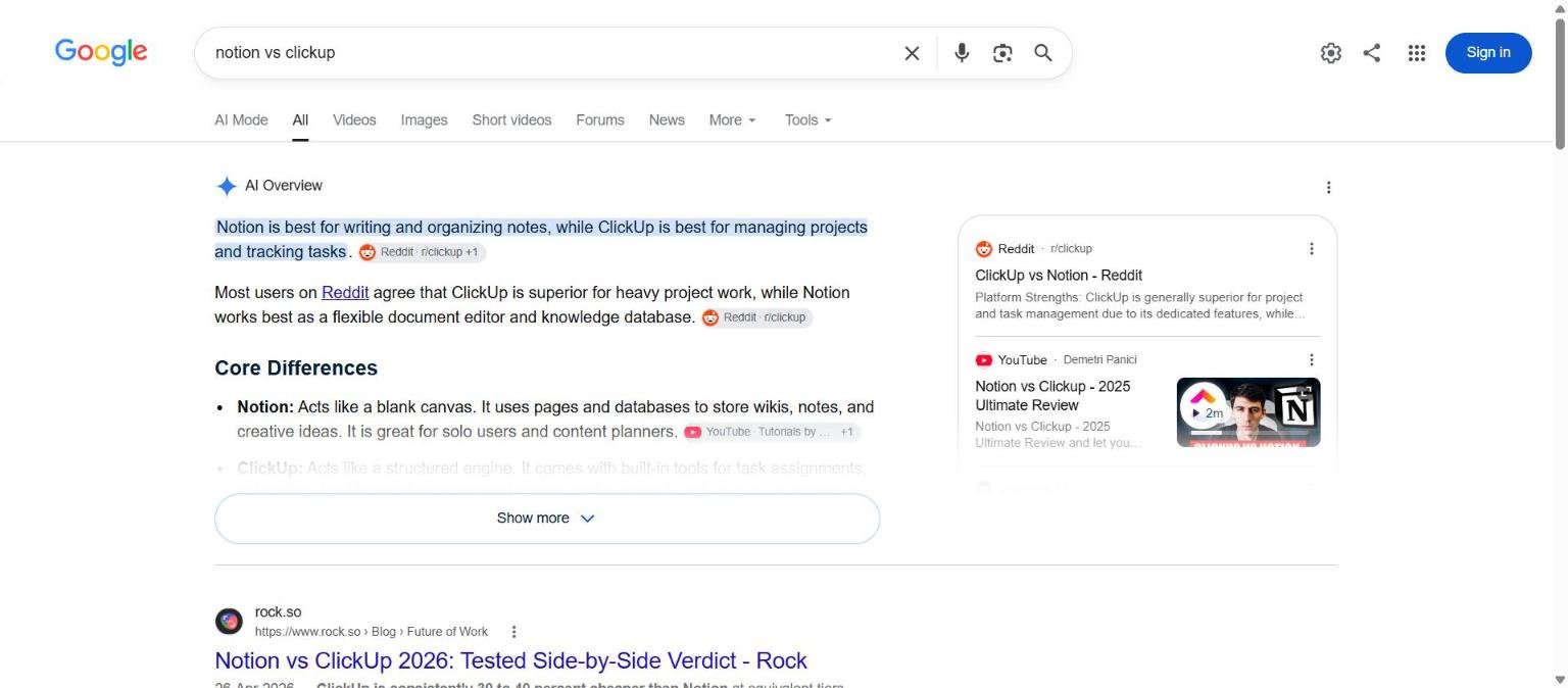
“Notion vs ClickUp”, “HubSpot vs Salesforce”, “Slack vs Teams”. Comparison searches are the second-highest-intent query type in SaaS after alternatives searches, and they have one unusual property: you can rank for them even when neither brand is yours.
This guide covers saas comparison pages for SaaS teams: what it means, why it matters, and the practical steps to get it right.
Three kinds of comparison page
| Type | Example | When to build it |
|---|---|---|
| You vs competitor | Linear vs Jira (you are Linear) | Every competitor you lose deals to |
| Competitor vs competitor | Notion vs ClickUp (you are neither) | High-volume pairs in your category; you appear as the third option |
| Category vs category | CRM vs spreadsheet, PM tool vs task list | Early-stage buyers deciding whether to buy software at all |
Most SaaS sites only build the first type. The second type is where the volume is.
Step 1: Find the pairs people actually search
Take your competitor list and search “[brand A] vs” in Ahrefs or Semrush with the “vs” filter. Google autocomplete works too: type “notion vs ” and note every suggestion. Combine the volumes for “A vs B” and “B vs A”; the SERP is the same.
Prioritise pairs where both brands are competitors of yours. A page comparing two tools you replace is a page whose every reader is your prospect.
Step 2: Get the facts right, with dates
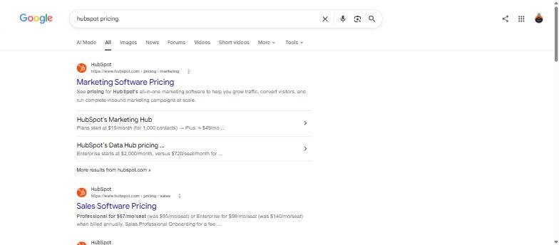
Comparison pages die when the pricing goes stale. Build a small facts sheet for each brand and re-check it quarterly:
- Plans and monthly price per seat, annual and monthly billing
- Free plan limits (users, records, storage)
- The five features buyers ask about in your category
- Integrations count and the three most requested integrations
- Support channels and SLAs by plan
- Security certifications (SOC 2, ISO 27001, GDPR DPA)
Step 3: The page structure that ranks
- Verdict paragraph. Who should pick A, who should pick B, and (if you are a third party) when neither is the right answer. Put a signup or “compare with [your tool]” button here.
- Side-by-side table. Ten to fifteen rows. This is what gets pulled into featured snippets and cited by AI answers.
- Head-to-head sections. One H2 per decision factor: pricing, ease of use, features, integrations, support, security. Two to three paragraphs each with a one-line winner.
- Who each tool is for. Team size, industry, workflow.
- The third option. If you are neither brand, this is where your product appears, with the same honesty applied to yourself.
- FAQ. “Is A better than B”, “Can I migrate from A to B”, “Does A integrate with B”.
Step 4: Do not fake neutrality
Readers can tell within a paragraph whether a comparison is honest. If you are one of the two brands, say so at the top (“We make Linear, so we have a stake in this. Here is where Jira wins anyway.”). Then actually name where you lose. Pages that do this convert better because the reader trusts the parts where you win.
Step 5: Use review data, not adjectives
Instead of “users love the interface”, pull the G2 ease-of-use score and the number of reviews it is based on. Quote one short complaint and one short compliment per tool from real reviews. It is more persuasive and it is the kind of original synthesis that Google’s helpful-content guidance rewards.
Step 6: Technical details that matter for comparison pages
- URL:
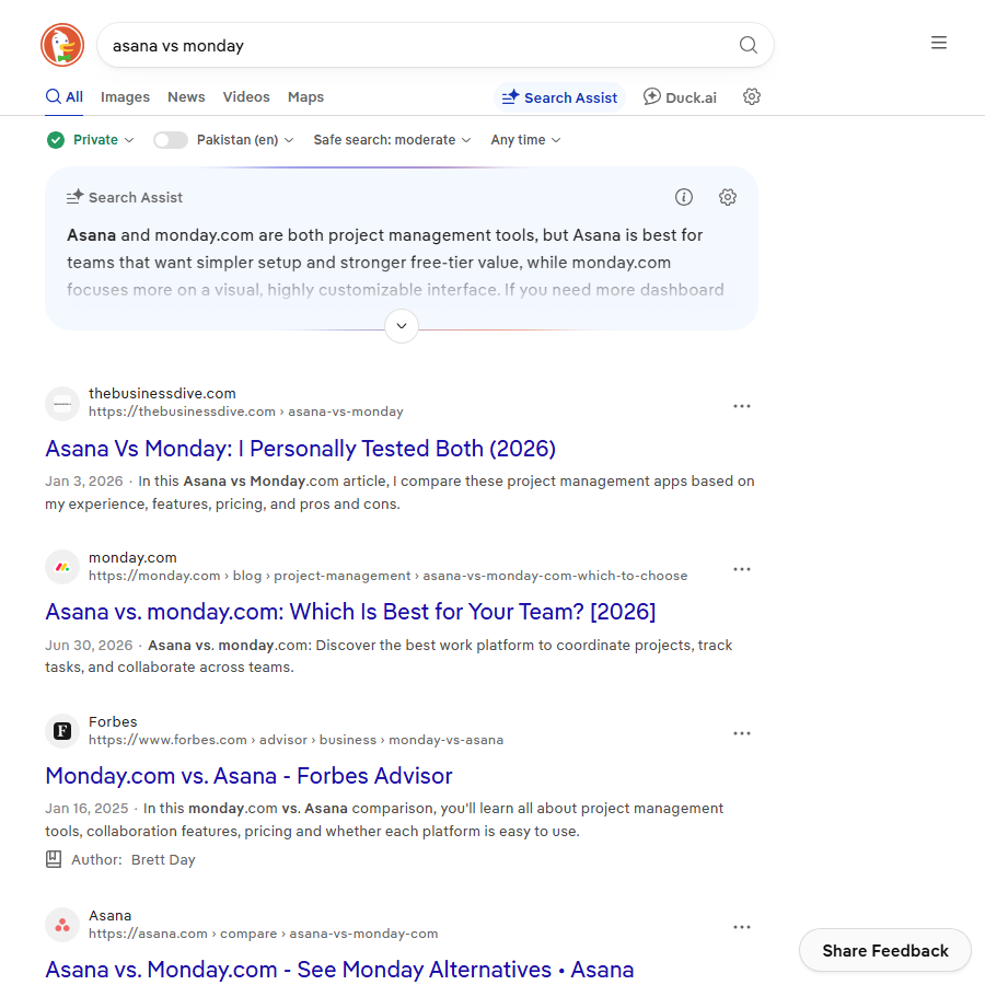
/compare/notion-vs-clickup/. One page per pair; do not create both A-vs-B and B-vs-A. - Title tag: “Notion vs ClickUp (2026): Pricing, Features and Which to Pick”. Preview it in the SERP Snippet Preview so the year and the verdict do not get truncated.
- Schema: FAQPage for the FAQ block. Avoid Review or Rating schema unless you have genuine user ratings on the page.
- Internal links: from both brands’ alternatives pages and from the category “best of” page.
- Refresh: update the year in the title and re-check pricing every quarter. Set a calendar reminder; stale comparison pages lose rankings fast.
Frequently asked questions about SaaS comparison pages
Can I rank for “A vs B” if I am neither A nor B?
Yes. Many of the top results for popular pairs are third-party pages. Your advantage is a clear verdict and an honest third option.
Should the comparison be a blog post or a product page?
A product page, outside the blog folder, with a signup CTA. It is bottom-of-funnel content and should be treated like a landing page.
How long should a comparison page be?
1,500 to 2,500 words. Long enough for a full table and six decision factors, short enough that the verdict is still near the top.
Do comparison pages get penalised for mentioning competitors?
No. Naming competitors is normal. Problems come from inaccurate claims and trademark misuse (logos, implied endorsement), not from the comparison itself.
Quick recap: Saas comparison pages
Saas comparison pages usually comes down to a short, repeatable checklist. Use this whenever saas comparison pages comes up again:
- Diagnose saas comparison pages by checking the relevant report first, not assumptions.
- Confirm the current setup is actually causing saas comparison pages before you change anything.
- Re-check saas comparison pages again after the fix ships, not before.
Treat saas comparison pages as an ongoing signal rather than a one-time fix. For background on the platform rules behind this, see Google Search Central.